Fintech Onboarding: Chime, Robinhood, Moneylion, Acorns

For many digital applications, onboarding is the stage at which the customer experience either begins or ends depending on the length and complication of the process. In fintech, this is also the point where there’s also a higher risk of identity fraud. Tailoring the fintech onboarding experience is hence considered to be one of the trickiest tasks for UX design specialists.
In this blog, we discuss the main challenges to creating efficient fintech onboarding UX design and take a look at some real-life examples of fintech onboarding excellence from leading industry players like Chime, Robinhood, MoneyLion and Acorns.
The rise of fintech apps
The coronavirus pandemic over the past couple of years signalled chaos for industries across the globe, but it did give digital businesses the chance to thrive unveiling some unique growth opportunities for the quickly emerging fintech sector.
Sector arms such as challenger banks allowed customers to easily access and manage their finances at the click of a button and without leaving their homes - a real bonus in times of full lockdown and social distancing, when access to physical branches is restricted or not possible. Only in 2020, according to Forbes, there had been a 72% rise in the use of fintech apps in Europe during the coronavirus pandemic.
The challenges of fintech onboarding
The option to download a fintech app onto your mobile device and access all of your finances instantly is appealing, especially in contrast to jumping through the hoops that can often come with traditional banking. Why would you head to a high street bank to fill in multiple forms, when you can go to a challenger bank such as Chime or Monzo and be signed up in less than ten minutes through an app?
Although there are many differences between traditional banking and fintech, one of the most attractive and revolutionary features of challenger banking offerings starts right at the beginning of the customer journey, with the onboarding process. According to a popular study by Built For Mars in 2020, it took 5x as many clicks to open an account with the UK incumbent First Direct, than it did with their challenger rival Revolut. The results of the study clearly proved the real advantages and power of a fintech’s onboarding process from a UX perspective.
Hence for many, fintech onboarding might seem like a simple and straightforward process, but in reality, it involves a lot of challenges. Finance is complex and keeping the balance between having enough friction and making the process simple, whilst also considering the ever-increasing regulatory and compliance requirements (e.g., KYC, AML and cybercrime), is no easy feat. But this is where the beauty of the fintech UX design craft lies. If you get your fintech UX and UI right you won’t only tick the compliance boxes, you’ll also ensure you’ve got a fintech app that users will want to come back to.
Below, we’ve summarised the top 3 challenges to mastering the fintech onboarding UX design:
Compliance and security
Fintechs, just like traditional financial service providers, are facing an increasing burden of regulatory and compliance requirements and restrictions due to the high risks of fraud and financial crime in the sector. There are 3 key areas, UX/UI designers need to consider and take extra care when creating fintech products and applications, especially in the retail banking space: cybercrime, Know Your Customer (KYC) and Anti-money-laundering (AML).
A possible way to tackle this challenge is by splitting the personal data collection process into multiple single steps that are carefully spread out along the entire onboarding journey, with the information requested only when needed (not in advance or at once). Including clear, user-friendly instructions and explanations on why particular information is being requested and collected can additionally build trust and enhance the overall user experience.
Financial complexity and jargon
Communicating complex financial products and concepts in a human and simple way is one of the biggest challenges for UX/UI designers in the fintech sector. Presenting complex financial information in a visual and interactive way with relevant graphics can further streamline and improve the user experience.
Friction balance
In most UX/UI design cases, eliminating friction is the designer’s ultimate goal. In fintech, however, a certain level of friction is often required, especially when a user’s personal finances are on the line. By adding just the right amount of friction at the right time, fintech UX designers can ensure users remain satisfied with the overall product experience whilst instilling a sense of reliability that their finances are protected against any unwanted accidents.
Fintech onboarding excellence: Lessons from Chime, Robinhood, MoneyLion and Acorns
Last year, the private identity tech leader, Incognia, published their first Mobile App Report including a Fintech Onboarding Friction Index which compared ten of the most popular fintech apps and their onboarding processes. In this section, we look at the top 4 fintechs that have mastered the onboarding process, particularly in how they’ve managed to keep the balance between providing enough fraud prevention and friction.
Incognia’s study included both a quantitative and qualitative analysis of the onboarding process for each app. The key factors and measures that were studied were:
- Quantitative: No. of screens, required fields, clicks and total application time.
- Qualitative: type of information required, ID verification, account security steps, handling of legal and privacy notices, and account configuration.
Among the companies with the highest scores from the study were Chime, Robinhood, MoneyLion and Acorns. Let’s see how each of them has handled the challenges related to fintech onboarding we discussed above.
Chime
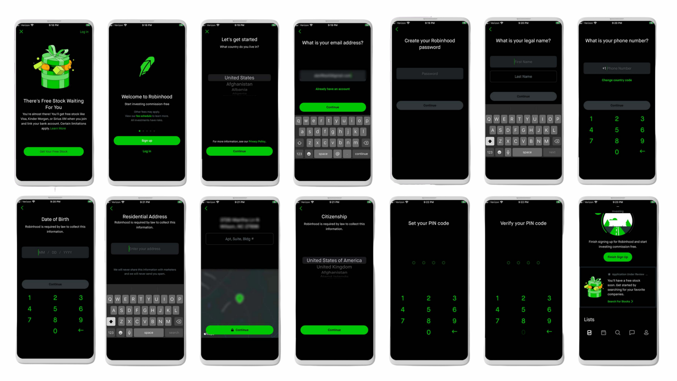
First up in the businesses that are demonstrating excellence with fintech onboarding is American mobile banking company, Chime. With an onboarding time coming in at around 4:30 min, that’s to complete a new account application, Chime gets off to a strong start for new customers coming to the app.
However, it’s not only the speed at which you can set up an account either that makes Chime a frontrunner in the space. With only 11 screens and 22 clicks featured across Chime’s sleek, clear interface, it’s apparent that UX has been taken into key consideration. It’s also interesting to see how Chime has tackled the complexity issue by requesting only one key piece of information per screen and explicitly explaining why certain personal information is being requested. In addition, to speed up the completion of the process, legal terms are presented as links for users to click into as they desire.

Robinhood
Next up we have Robinhood, a commission-free stock trading and investment app. With users being able to create a new account in as little as 5 minutes, Robinhood provides a fantastic friction balance when it comes to new users. As well as its minimalistic, straightforward appearance, Robinhood captures new user information effectively in as little as 16 clicks, with only 11 onboarding fields required.
Similar to Chime, Robinhood’s app also requires only one piece of information per screen. The company tackled the speed and friction challenge by not including the configuration stage of the account as part of the onboarding process. Instead, the configuration is optional and the user can opt to configure the account later.
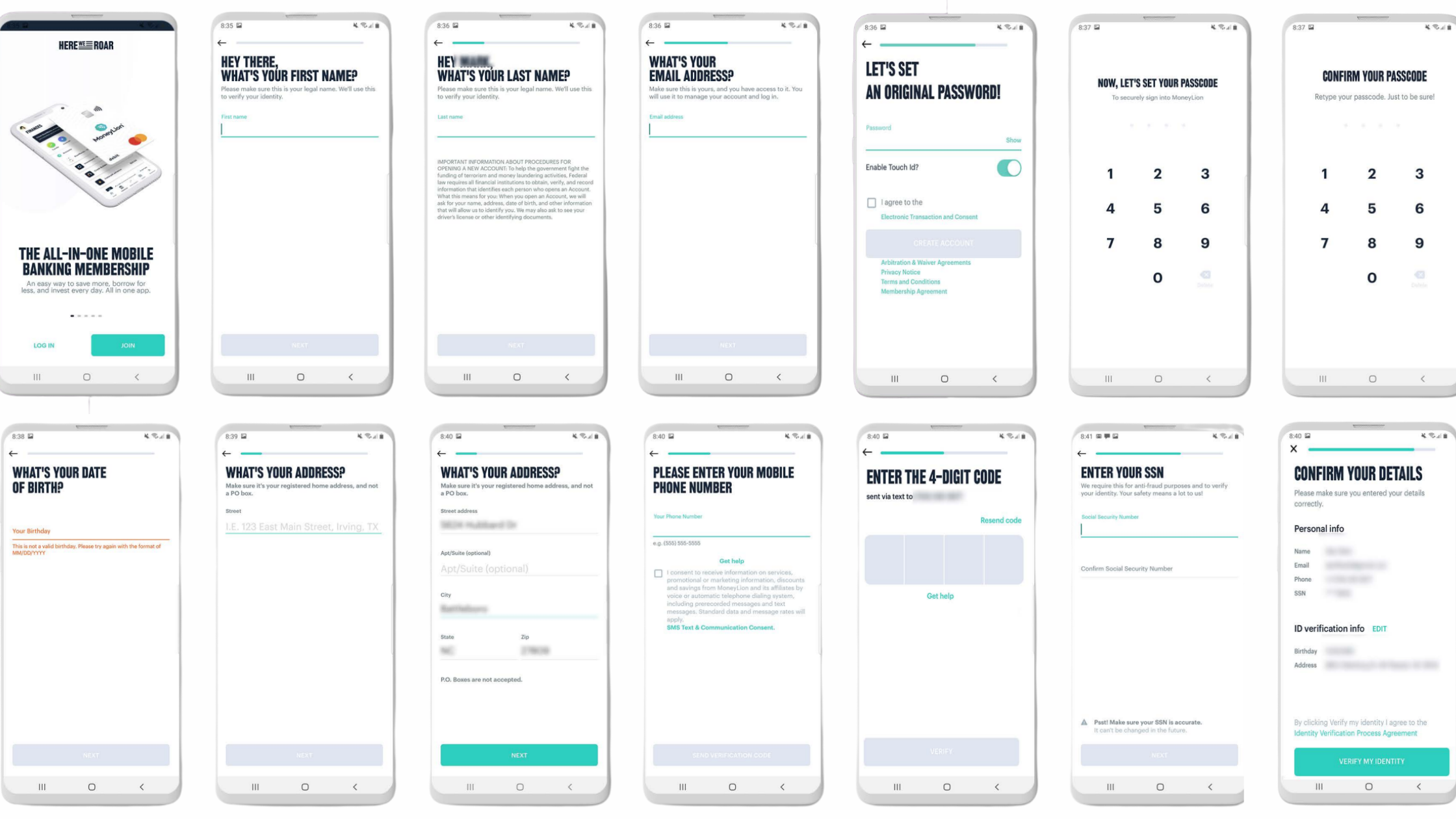
MoneyLion
Sitting in the all-in-one mobile banking space, MoneyLion also boasts an uncomplicated UI, with careful thought into fintech UX. Despite requiring a higher number of clicks (26) and screens (15) than the previous two fintech apps, users can still complete the opening of their account in about 5 minutes.
With a minimalist design and clear instructions, MoneyLion has made the entire process as sleek and easy as possible. Similar to Chime, to optimise the process, the app presents all legal terms and conditions as links.
Acorns
Last but not least, Acorns also sits in the investment and trading space and although it requires a slightly higher number of clicks than Robinhood, with Acorns sitting at 23, it’s still a fintech app that you can tell has been created with UX in mind. 12 screens during the onboarding process make this application for new users a total breeze and the simple white backdrop teamed with a black font makes things very accessible and easy to navigate.
Similar to Chime, the app explicitly explains why certain personal information is being requested at each step. To overcome the tediousness challenge of the process, Acorns has also included a number of animations that make the overall process a bit more dynamic and interactive.

Summary
Fintech onboarding is essential for the success of any fintech application as it can literally make or break the customer experience. Based on the examples we just reviewed, we can conclude that the formula for an excellent and efficient fintech onboarding is a combination of simple yet eye-pleasing and dynamic graphic design with just the right amount of friction, security and instructions.
Need help with your fintech product design?
We have worked with dozens of fintech businesses, from investment brokers to crypto neobanks to BNPL providers, and we know how to fix your product design once and for all.